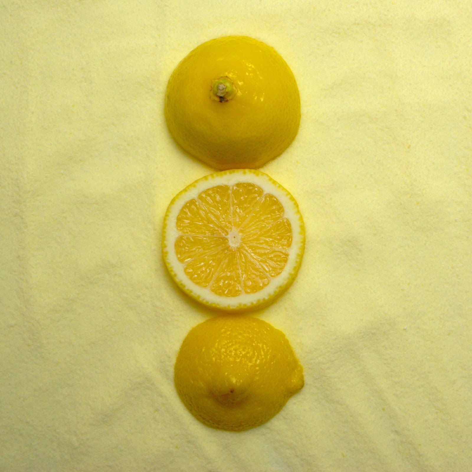
some studies:
Wednesday, October 8, 2014
Thursday, September 25, 2014
Tuesday, September 23, 2014
More Color!
Check in for more images by the end of the week!
Here is one test from this evening…..I think I am going to take some film with this work……
Sunday, September 21, 2014
Zeren Badar
Something about his work intrigues me and the work I am currently making. Check his work out: http://www.zerenbadar.com/#!accident-series I would also google his name and look through images….he did not seem to have the whole series on his website.
Saturday, September 20, 2014
Questions
Ok. So here are some questions I currently should be asking. Any ideas or thought would be appreciated.
- Does it have to be a square?
- Do they have to resemble the same color?
- compliments
- contrasting
- shades/tints/values
- or does it just have to be an artificial and natural color and does not matter where the color comes from or what it is, just match them and see what happens
- How would these look if I brought back the idea of the corporate logos?
- working on 2-3 backgrounds of multiple corporate logos composed and formatted into square sections to create a whole image referring to one color
- Do a study that plays with 'role reversal' like Albers (might not be using the right description)
- having one study be two colors, one on the inside and one of the outside, and another study right next to it reversing the colors to be out and in.
- Should I start thinking about having two images next to one another
- one fresh and one decayed
- one messy and one organized
- one of flay color and one of textured color
- Does it have to be organized?
- can i muck it up a bit?
- not put things into a format but just to lay them out onto one another.
- Should I photograph the decay of these set ups?
- How, or should I, incorporate the Pantone color?
- does this have anything to do with my work?
- can it make sense?
Looks like I have work to do!
Bye for Now!
Wednesday, September 17, 2014
This was exciting!!!
First off let me apologize for the poor images. These are all just tests! They have not been photographed with film and these are not edited in Photoshop. I am trying to see if it something that I will continue to do for this project. I am focusing more on artificial and natural at the moment with this work and so it involved more than just food and flowers. Take a look!!
Monday, September 15, 2014
New thoughts on color, artificial and natural
Some ideas I had the other night….
Here is one played out:
these would look amazing photographed with some film….. yay! I also was thinking of playing with waxing over the actual images and hanging those….hmmmmmmm what do you think?
Here are some ideas I had:
colored frosting smeared on a board and some flowers in the middle
wrapping paper with some colored sand inside
yellow chalk crushed or not on top of some spaghetti noodles.
sliced meats with actual sand from the ground
I also thought about the Magritte reference I was using before and I thought it would be interesting to use the slogans of one of these sources as the reference instead of this is not color etc.
I am working on some digital images as well for backgrounds but may is it hard to stare at the computer for extended amounts of time!
What do you know about pantone? I am doing my research and thinking about looking at this idea of color instead of the digital side of things.
i want to make my own still life… I mean these old painters were so symbolic and i thought, can I do that?
Ok. so for now…I will read, research and take a run to the store! If only I had a day off….where did summer go and why didn't these ideas come then!!
til next time.
Update on Day Ten for these two studies. I do not like the glass when being photographed… and the blue has become too busy and organized for this experiment but I will continue to study t.
Thursday, September 11, 2014
Disappointed
I am so disappointed right now. All the files I saved for making a background, we never saved. I feel like a failure and time has been lost. Now I must go back into the internet sea and find all the green logos and red logos (A LOT) and download them again. Just mad.
Monday, September 8, 2014
Struggles...
So…. I ended up hitting a wall. I need to do more construction haha. I am looking for tiles and carpet pieces that should be about a foot squared but the major stores make it impossible to get because everything is in bulk. I am on a mission tomorrow to find some local stores that may have some scraps for the taking. Only problem is the may have scraps but it may not be colored. I am starting to feel a little lost again. Maybe I will tackle the grocery store tomorrow with my paint swatches to see what matches. I feel like a bum because I have not photographed any film and I am only taking snap shots of my test subjects to see what works. Its acceptable just not what I am used to! I want to make some images and something consistent!!!! I guess I will get back to my red logo hunt. Looking at compliments for the logo backgrounds but it is taking me forever!
Sunday, September 7, 2014
Technical Difficulties
I am just finding out that some of my posts have not been publishing. This is very frustrating to me but it is for some reason happening on my phone app. Please forgive me, I have all my posts up and published now. Thanks!
Studies of red and blue again...
This So I have created two studies. One of red in a shadow box frame and one of blue as a composition made on foam board. I am watching each one everyday to see their change in color. They both contain artificial and natural elements and I am curious to see how they decay.
Day two: 


Day three:

This should be interesting. I am also working on making another corporate logo background but with as many as I can find within one color. This is hard to do. It's coming along though. If you have any information about artificial and natural and what the two mean to you, please let me know! I am thinking about using a digital reference for say the color orange and then trying to match that color in both the artificial and natural world to make almost like a triptych, I am still trying to figure out to do this though.....not that tech savy. In the menatime I have picked up some paint swatches to play with this idea and see if I can match the color elsewhere. Of course I'm going to look like a fool at the store holding paint swatches up to food or labels but that's all part of the fun!
Think I can match any of these????? I will also be looking at getting both natural and artificial materials like carpet, Duran wrap, wrapping paper, construction paper etc and making a collage with a square then a square made of food or flowes, something natural. Simple. Elegant. That's on this weeks agenda! But for now I must get back to my still life reading and research on this matter. :) enjoy!
Think I can match any of these????? I will also be looking at getting both natural and artificial materials like carpet, Duran wrap, wrapping paper, construction paper etc and making a collage with a square then a square made of food or flowes, something natural. Simple. Elegant. That's on this weeks agenda! But for now I must get back to my still life reading and research on this matter. :) enjoy! Studies.
Check out my Instagram, Twitter, and tumblr. Here are some images I'm studying. 

All studies taken with my iPhone. Just thinking and testing color ideas out. Exhausting. The thoughts are if you can intertwine both artificial and organic color could we actually tell what's real and what's not. What kind of world do we live in? Another thought of how to tackle the food dilemma and deception we face today.
Wednesday, August 13, 2014
Subscribe to:
Posts (Atom)